 Веб-дизайнеру
 Веб-разработчику
 Дополнительно
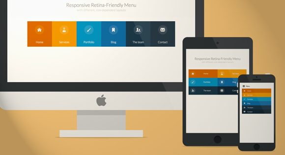
Современное CSS3 меню + мобильная версия!

 Скачать
 Демо
Демо
↓ Также Вам будет интересно ↓


Сегодня мы будем создавать красочные CSS3 меню в цветовом стиле Maliwan. Главная особенность этого современного меню, состоит в том, что оно автоматически меняется на одну из трех версий в зависимости от размера окна браузера: версия по умолчанию для больших экранов, версия для планшетов в две колонки и мобильная версия меню со ссылкой отображения и скрытия навигации для небольших экранов. Также есть ещё выдвигающееся меню, которое можно увидеть в статье “Выдвигающееся меню навигации на JQuery”.
Чтобы сделать меню полностью практичным, мы будем использовать в качестве иконок шрифт, поэтому с ними проблем не будет, они будут отлично изменяться под версию меню.
Подготовка иконок для шрифта
Создание собственного шрифта иконок может показаться сложным, но с такими инструментами, как IcoMoon это просто вопрос создания икон. Шрифт иконок ведет себя как любой обычный шрифт, так что вы можете легко изменить его цвет, адаптировать размер. Идеально подходит для мобильных устройств, без необходимости использовать несколько свойств для разных разрешений экрана.
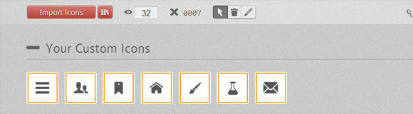
Первое, что нам нужно сделать, это создать иконки для меню. Я использую иллюстратор, но любой другой векторной редактор графики, например, Inkscape, также подойдет. Нам нужно создать значки и экспортировать их в виде файлов SVG. Чтобы убедиться, что значок будет правильно работать во всех браузерах, мы должны преобразовать все строки в объект и объединить все объекты в одну большую форму для каждой иконки. После того как мы имеем SVG файлы, мы можем импортировать их в инструмент App IcoMoon:
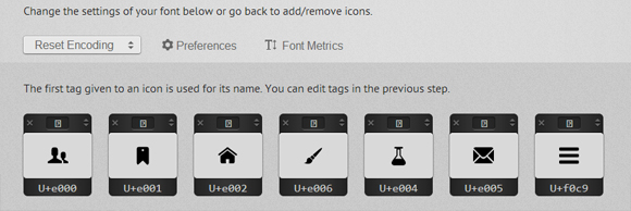
Мы также можем расширить количество иконок нашего шрифта, используя подборку, которую предлагает IcoMoon. После того как у нас есть все необходимые иконки, мы нажимаем на кнопку "FONT→" в нижней части страницы, чтобы войти в подробные настройки. На этой странице мы можем выбрать параметры кодирования для шрифта, а также выбрать, если мы хотим назначить свои буквы, слова для вывода иконок. Я рекомендую использовать параметры по умолчанию, всё работает отлично.
Когда мы нажимаем на кнопку "Download", мы получаем ZIP файл и 4 формата шрифтов (SVG, EOT, TTF и WOFF), стили CSS и демонстрационную страницу.
Первое, что нужно сделать, чтобы шрифты работали, это подключить все необходимое, а также скопировать папку шрифтов. Там также нужно немного “допилить” его, чтобы шрифты хорошо выглядели на Chrome ОС Windows. В общем получится у Вас что-то вроде этого:
|
1 2 3 4 5 6 7 8 9 10 11 12 13 14 15 16 17 18 |
@font-face { font-family: 'CardoRegular'; src: url('../fonts/Cardo104s-webfont.eot'); src: url('../fonts/Cardo104s-webfont.eot?#iefix') format('embedded-opentype'), url('../fonts/Cardo104s-webfont.woff') format('woff'), url('../fonts/Cardo104s-webfont.ttf') format('truetype'), url('../fonts/Cardo104s-webfont.svg#CardoRegular') format('svg'); font-weight: normal; font-style: normal; } @media screen and (-webkit-min-device-pixel-ratio:0) { @font-face { font-family: 'CardoRegular'; src: url('../fonts/Cardo104s-webfont.svg#CardoRegular') format('svg'); } } |
Но Вы естественно используете свои пути к шрифтам и так далее, в общем с этим, я думаю, понятно.
Начинаем работу с HTML
Структура html для меню будет выглядеть следующим образом:
|
1 2 3 4 5 6 7 8 9 10 11 12 13 14 15 16 17 18 19 20 21 22 23 24 25 26 27 28 29 30 31 32 33 34 35 36 37 38 39 40 41 42 43 44 45 46 47 48 49 50 51 52 |
<nav id="menu" class="nav"> <ul> <li> <a href="#"> <span class="icon"> <i aria-hidden="true" class="icon-home"></i> </span> <span>Главная</span> </a> </li> <li> <a href="#"> <span class="icon"> <i aria-hidden="true" class="icon-services"></i> </span> <span>Сервисы</span> </a> </li> <li> <a href="#"> <span class="icon"> <i aria-hidden="true" class="icon-portfolio"></i> </span> <span>Портфолио</span> </a> </li> <li> <a href="#"> <span class="icon"> <i aria-hidden="true" class="icon-blog"></i> </span> <span>Блог</span> </a> </li> <li> <a href="#"> <span class="icon"> <i aria-hidden="true" class="icon-team"></i> </span> <span>Команда</span> </a> </li> <li> <a href="#"> <span class="icon"> <i aria-hidden="true" class="icon-contact"></i> </span> <span>Контакты</span> </a> </li> </ul> </nav> |
Для активации шрифта иконок мы просто используем класс icon-iconname внутри элемента i . Также обратите внимание, что мы добавили класс no-js, но он будет изменен на js с помощью Modernizr. Идея состоит в том, чтобы иметь возможность доступным меню, если пользователь отключил JavaScript. Мы будем также использовать Modernizr для обнаружения сенсорной поддержки.
Прелести CSS и JAVASCRIPT
Глобальные CSS стили, которые будут применяться для всех размеров экрана выглядят следующим образом:
|
1 2 3 4 5 6 7 8 9 10 11 12 13 14 15 16 17 18 19 20 21 22 23 24 25 26 27 28 29 30 31 32 |
/* Global CSS that are applied for all screen sizes */ .nav ul { max-width: 1240px; margin: 0; padding: 0; list-style: none; font-size: 1.5em; font-weight: 300; } .nav li span { display: block; } .nav a { display: block; color: rgba(249, 249, 249, .9); text-decoration: none; transition: color .5s, background .5s, height .5s; } .nav i{ /* Make the font smoother for Chrome */ transform: translate3d(0, 0, 0); } /* Remove the blue Webkit background when element is tapped */ a, button { -webkit-tap-highlight-color: rgba(0,0,0,0); } |
Мы хотим чтобы при наведении на один из пунктов меню, он выдвигался немного вниз, а остальные немного затемнялись.
|
1 2 3 4 5 6 7 8 9 |
/* Hover effect for the whole navigation to make the hovered item stand out */ .no-touch .nav ul:hover a { color: rgba(249, 249, 249, .5); } .no-touch .nav ul:hover a:hover { color: rgba(249, 249, 249, 0.99); } |
Далее мы хотим добавить интересные цвета фона для всех элементов. Приведенный ниже код использует nth-child технику для выбора элементов списка. Таким образом, вы можете добавлять много элементов списка и при этом цветовой код будет повторятся.
|
1 2 3 4 5 6 7 8 9 10 11 12 13 14 15 16 17 18 19 20 21 22 23 |
.nav li:nth-child(6n+1) { background: rgb(208, 101, 3); } .nav li:nth-child(6n+2) { background: rgb(233, 147, 26); } .nav li:nth-child(6n+3) { background: rgb(22, 145, 190); } .nav li:nth-child(6n+4) { background: rgb(22, 107, 162); } .nav li:nth-child(6n+5) { background: rgb(27, 54, 71); } .nav li:nth-child(6n+6) { background: rgb(21, 40, 54); } |
Использование min-width, будет ориентироваться на экраны, которые больше, чем 800px (50em, с размером шрифта 15px) для преобразования нашего списка в современное горизонтальное меню навигации:
|
1 2 3 4 5 6 7 8 9 10 11 12 13 14 |
@media (min-width: 50em) { /* Transforms the list into a horizontal navigation */ .nav li { float: left; width: 16.66666666666667%; text-align: center; transition: border .5s; } .nav a { display: block; width: auto; } |
Мы продолжаем работу над nth-child техникой, и добавим 4px border-bottom. Мы применяем его при наведении курсора мыши, при фокусе и активации, чтобы заставить его работать на сенсорных устройствах.
|
1 2 3 4 5 6 7 8 9 10 11 12 13 14 15 16 17 18 19 20 21 22 23 24 25 26 27 28 29 30 31 32 33 34 35 36 37 |
/* hover, focused and active effects that add a little colored border to the different items */ .no-touch .nav li:nth-child(6n+1) a:hover, .no-touch .nav li:nth-child(6n+1) a:active, .no-touch .nav li:nth-child(6n+1) a:focus { border-bottom: 4px solid rgb(174, 78, 1); } .no-touch .nav li:nth-child(6n+2) a:hover, .no-touch .nav li:nth-child(6n+2) a:active, .no-touch .nav li:nth-child(6n+2) a:focus { border-bottom: 4px solid rgb(191, 117, 20); } .no-touch .nav li:nth-child(6n+3) a:hover, .no-touch .nav li:nth-child(6n+3) a:active, .no-touch .nav li:nth-child(6n+3) a:focus { border-bottom: 4px solid rgb(12, 110, 149); } .no-touch .nav li:nth-child(6n+4) a:hover, .no-touch .nav li:nth-child(6n+4) a:active, .no-touch .nav li:nth-child(6n+4) a:focus { border-bottom: 4px solid rgb(10, 75, 117); } .no-touch .nav li:nth-child(6n+5) a:hover, .no-touch .nav li:nth-child(6n+5) a:active, .no-touch .nav li:nth-child(6n+5) a:focus { border-bottom: 4px solid rgb(16, 34, 44); } .no-touch .nav li:nth-child(6n+6) a:hover, .no-touch .nav li:nth-child(6n+6) a:active, .no-touch .nav li:nth-child(6n+6) a:focus { border-bottom: 4px solid rgb(9, 18, 25); } |
Затем мы размещали иконки и текст:
|
1 2 3 4 5 6 7 8 9 10 |
/* Placing the icon */ .icon { padding-top: 1.4em; } .icon + span { margin-top: 2.1em; transition: margin .5s; } |
Также мы используем эффект анимации при наведении и немного увеличиваем высоту элемента.
|
1 2 3 4 5 6 7 8 9 10 11 12 13 14 15 16 |
/* Animating the height of the element*/ .nav a { height: 9em; } .no-touch .nav a:hover , .no-touch .nav a:active , .no-touch .nav a:focus { height: 10em; } /* Making the text follow the height animation */ .no-touch .nav a:hover .icon + span { margin-top: 3.2em; transition: margin .5s; } |
Теперь мы позиционируем иконки и подготавливаем их к CSS transition:
|
1 2 3 4 5 6 7 8 9 10 11 12 13 |
/* Positioning the icons and preparing for the animation*/ .nav i { position: relative; display: inline-block; margin: 0 auto; padding: 0.4em; border-radius: 50%; font-size: 1.8em; box-shadow: 0 0 0 0.8em transparent; background: rgba(255,255,255,0.1); transform: translate3d(0, 0, 0); transition: box-shadow .6s ease-in-out; } |
Чтобы задать визуальный эффект, мы изменяем размер тени с 0.8em до 0, а его цвет от прозрачного до цвета с высокой непрозрачностью.
|
1 2 3 4 5 6 7 8 9 |
/* Animate the box-shadow to create the effect */ .no-touch .nav a:hover i, .no-touch .nav a:active i, .no-touch .nav a:focus i { box-shadow: 0 0 0px 0px rgba(255,255,255,0.2); transition: box-shadow .4s ease-in-out; } } |
Мы устанавливаем второй запрос media-jquery, чтобы сделать небольшую корректировку для экранов от 800px до 980px:
|
1 2 3 4 5 6 7 8 |
@media (min-width: 50em) and (max-width: 61.250em) { /* Size and font adjustments to make it fit better */ .nav ul { font-size: 1.2em; } } |
Мобильная версия меню, для планшетов и мобильных устройств
Теперь, когда мы закончили с обычными настольными версиями (в том числе и для планшетов, с разрешением 1024px и более), мы продумаем “глобальные” CSS стили для экранов, которые меньше 800px, что составляет 49.938em, используя max-width.
|
1 2 3 4 5 6 7 8 9 10 11 12 13 14 15 16 17 18 19 20 21 22 23 24 25 26 27 28 29 30 31 32 33 34 35 36 37 38 39 40 41 42 43 44 45 46 |
/* The "tablet" and "mobile" version */ @media (max-width: 49.938em) { /* Instead of adding a border, we transition the background color */ .no-touch .nav ul li:nth-child(6n+1) a:hover, .no-touch .nav ul li:nth-child(6n+1) a:active, .no-touch .nav ul li:nth-child(6n+1) a:focus { background: rgb(227, 119, 20); } .no-touch .nav li:nth-child(6n+2) a:hover, .no-touch .nav li:nth-child(6n+2) a:active, .no-touch .nav li:nth-child(6n+2) a:focus { background: rgb(245, 160, 41); } .no-touch .nav li:nth-child(6n+3) a:hover, .no-touch .nav li:nth-child(6n+3) a:active, .no-touch .nav li:nth-child(6n+3) a:focus { background: rgb(44, 168, 219); } .no-touch .nav li:nth-child(6n+4) a:hover, .no-touch .nav li:nth-child(6n+4) a:active, .no-touch .nav li:nth-child(6n+4) a:focus { background: rgb(31, 120, 176); } .no-touch .nav li:nth-child(6n+5) a:hover, .no-touch .nav li:nth-child(6n+5) a:active, .no-touch .nav li:nth-child(6n+5) a:focus { background: rgb(39, 70, 90); } .no-touch .nav li:nth-child(6n+6) a:hover, .no-touch .nav li:nth-child(6n+6) a:active, .no-touch .nav li:nth-child(6n+6) a:focus { background: rgb(32, 54, 68); } .nav ul li { transition: background 0.5s; } } |
Для размеров экрана между 520px (32.5em) и 799px (49.938em), мы показываем наше меню в 2 столбца и 3 строки. Мы добавили немного отступа padding, чтобы сделать его юзабельным, и отображения иконок слева, а текста справа.
|
1 2 3 4 5 6 7 8 9 10 11 12 13 14 15 16 17 18 19 20 21 22 23 24 25 26 27 28 29 30 31 32 33 34 |
/* CSS for a 2x3 columns version */ @media (min-width: 32.5em) and (max-width: 49.938em) { /* Creating the 2 column layout using floating elements once again */ .nav li { display: block; float: left; width: 50%; } /* Adding some padding to make the elements look nicer*/ .nav a { padding: 0.8em; } /* Displaying the icons on the left, and the text on the right side using inline-block */ .nav li span, .nav li span.icon { display: inline-block; } .nav li span.icon { width: 50%; } .nav li .icon + span { font-size: 1em; } .icon + span { position: relative; top: -0.2em; } |
Анимация, которую мы сделали для больших экранов, слишком сложна, чтобы вписаться в небольшое разрешение, поэтому мы адаптируем его и сделаем более простым, более сдержанным, но добавим креативности с помощью border.
|
1 2 3 4 5 6 7 8 9 10 11 12 13 14 15 16 17 18 19 |
/* Adapting the icons to animate the size and border of the rounded background in a more discreet way */ .nav li i { display: inline-block; padding: 8% 9%; border: 4px solid transparent; border-radius: 50%; font-size: 1.5em; background: rgba(255,255,255,0.1); transition: border .5s; } /* Transition effect on the border color */ .no-touch .nav li:hover i, .no-touch .nav li:active i, .no-touch .nav li:focus i { border: 4px solid rgba(255,255,255,0.1); } } |
Опять же, для небольших экранов мы адаптируем размер шрифта и ширину.
|
1 2 3 4 5 6 7 8 9 10 11 12 |
/* Adapting the font size and width for smaller screns*/ @media (min-width: 32.5em) and (max-width: 38.688em) { .nav li span.icon { width: 50%; } .nav li .icon + span { font-size: 0.9em; } } |
Для очень маленьких экранов, мы прячем навигацию и отображаем кнопку "Меню". Пользователь может нажать, если он хочет отобразить и увидеть меню. Чтобы сделать это, мы опираемся на несколько строк JavaScript:
|
1 2 3 4 5 6 7 8 9 10 11 12 13 14 15 16 17 18 19 20 |
// The function to change the class var changeClass = function (r,className1,className2) { var regex = new RegExp("(?:^|\\s+)" + className1 + "(?:\\s+|$)"); if( regex.test(r.className) ) { r.className = r.className.replace(regex,' '+className2+' '); } else{ r.className = r.className.replace(new RegExp("(?:^|\\s+)" + className2 + "(?:\\s+|$)"),' '+className1+' '); } return r.className; }; // Creating our button for smaller screens var menuElements = document.getElementById('menu'); menuElements.insertAdjacentHTML('afterBegin','<button type="button" id="menutoggle" class="navtoogle" aria-hidden="true"><i aria-hidden="true" class="icon-menu"> </i> Menu</button>'); // Toggle the class on click to show / hide the menu document.getElementById('menutoggle').onclick = function() { changeClass(this, 'navtoogle active', 'navtoogle'); } |
Для того чтобы иметь более чистый HTML, я решил создать кнопку “Меню” и вставить её с использованием JavaScript. Функция changeClass служит нам для переключения между активными классами, когда пользователь нажимает на кнопку.
Теперь у нас есть все, что нужно для малых экранов. Следующие стили код кнопки меню:
|
1 2 3 4 5 6 7 8 9 10 11 12 13 14 15 16 17 18 19 20 21 22 |
/* Styling the toggle menu link and hiding it */ .nav .navtoogle{ display: none; width: 100%; padding: 0.5em 0.5em 0.8em; font-family: 'Lato',Calibri,Arial,sans-serif; font-weight: normal; text-align: left; color: rgb(7, 16, 15); font-size: 1.2em; background: none; border: none; border-bottom: 4px solid rgb(221, 221, 221); cursor: pointer; } .icon-menu { position: relative; top: 3px; line-height: 0; font-size: 1.6em; } |
По умолчанию, кнопка меню скрыта. Мы хотим отображать её только для экранов, размером не более 519px (32.438em):
|
1 2 3 4 5 6 7 |
@media (max-width: 32.438em) { /* Unhiding the styled menu link */ .nav .navtoogle{ margin: 0; display: block; } |
Мы анимируем высоту навигации, когда кнопка нажата. Для закрытия навигации, мы даем ему высоту 0em, а чтобы открыть его, мы даем max-height 30em. Если JavaScript не включен, мы кнопку не отображаем, а просто используем класс no-js, для постоянного отображение меню.
|
1 2 3 4 5 6 7 |
/* Animating the height of the navigation when the button is clicked */ /* If JavaScript is disabled, the menu stays open */ .no-js .nav ul { max-height: 30em; overflow: hidden; } |
Когда JavaScript на стороне пользователя включен, по умолчанию мы скрываем меню, и показываем его, когда пользователь нажимает на кнопку, которая затем получает active класс:
|
1 2 3 4 5 6 7 8 9 10 11 12 |
/* When JavaScript is enabled, we hide the menu */ .js .nav ul { max-height: 0em; overflow: hidden; } /* Displaying the menu when the user has clicked on the button */ .js .nav .active + ul { max-height: 30em; overflow: hidden; transition: max-height .4s; } |
Мы адаптируем навигацию для небольших экранов, представляя её списком со значком слева и текстом с правой стороны:
|
1 2 3 4 5 6 7 8 9 10 11 12 13 14 15 |
/* Adapting the layout of the menu for smaller screens: icon on the left and text on the right */ .nav li span { display: inline-block; height: 100%; } .nav a { padding: 0.5em; } .icon + span { margin-left: 1em; font-size: 0.8em; } |
Мы также добавляем 8px границы border слева от каждого элемента, с ярким цветом:
|
1 2 3 4 5 6 7 8 9 10 11 12 13 14 15 16 17 18 19 20 21 22 23 24 |
/* Adding a left border of 8 px with a different color for each menu item*/ .nav li:nth-child(6n+1) { border-left: 8px solid rgb(174, 78, 1); } .nav li:nth-child(6n+2) { border-left: 8px solid rgb(191, 117, 20); } .nav li:nth-child(6n+3) { border-left: 8px solid rgb(13, 111, 150); } .nav li:nth-child(6n+4) { border-left: 8px solid rgb(10, 75, 117); } .nav li:nth-child(6n+5) { border-left: 8px solid rgb(16, 34, 44); } .nav li:nth-child(6n+6) { border-left: 8px solid rgb(9, 18, 25); } |
Навигация выглядит хорошо при тестировании на больших экранах. Но на мобильных устройствах, элементы меню могут быть не эффективны, точнее не юзабельны. Использование Modernizr поможет обнаружить сенсорное устройство. Если устройство имеет сенсор, то мы добавляем класс touch. Мы можем использовать этот класс для повышения точности нажатия, чтобы пользователь мог легко нажать на выбранный пункт меню. И вот мы закрываем последний media запрос.
|
1 2 3 4 5 |
/* make the nav bigger on touch screens */ .touch .nav a { padding: 0.8em; } } |
И это все, что было необходимо для создания приятного, современного меню, которое будет отлично работать как на настольных компьютерах, так и на планшетах и мобильных устройствах с маленьким разрешением экрана. Надеюсь Вам понравилось!
Данный урок подготовлен для вас командой сайта vladmaxi.net
Источник урока:
Перевел: Владислав Бондаренко

